Thursday, 23 February 2012
Question Five.
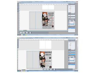
From my questionnaire Question 6 was important to the design in order to attract my target audience. The largest amount of people said that the colour scheme black, red and grey would attract them more to a magazine.
Question 13 was about the title, and as this is the thing that people remember and are attracted to immesiately when they look at a front cover, it needed to be big and bold. By using the title 'BOOM', I was able to fit it on and make it large, and it fits the description that everyone came back with when describing what a title should be - snappy, easy to remember and sounds good.
Question 16 asks if people prefer to read or enjoy the images more, and the majority chose the pictures - therefore all writing on the front cover is short and snappy and it is taken over by the main image.
Wednesday, 22 February 2012
Tuesday, 21 February 2012
Monday, 20 February 2012
Subscribe to:
Posts (Atom)


